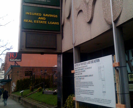
The Washington Federal Savings and Loan at 2020 NW Market has submitted a Land Use Application to tear down and rebuild their current space on Market.

The notice of the Land Use Application was published this morning by the Department of Planning and Development. The plans call for “a two story commercial structure containing 9,000 sq. ft. retail space (Washington Federal Saving Bank). Review includes demolition of existing 7,045 sq. ft. building.” There is also notice for a drive-up teller station and 15 parking spaces on the adjacent lot at 2021 NW 56th St.

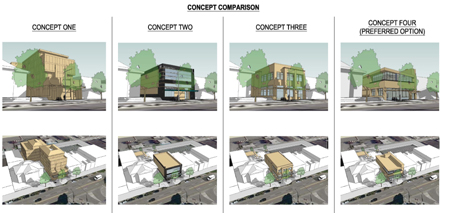
Back in October, there was an Early Design Guidance Meeting for the proposal which the design team presented four sets different concepts. (Read the entire presentation and see concepts here. .pdf) “An important design consideration is to create an appropriate relationship with the Carnegie Free Library building to the west, as well as to address and extend the existing pedestrian walkway, which runs along the neighbor’s property line and provides an effective midblock connection for this otherwise long Ballard block,” the Design Review report (.pdf) states.
According to today’s notice, there will be at least one more Design Review meeting in the future as well as an environmental review. The Public comment period on this project runs until February 17th. (Thanks Dave for the tip and Silver for the top photo.)

I'd love to hear whether design is regulated by the ballard historical society or some other group that helps keep marketstreet looking decent. This building is kind of weird, but it's got that great tile array in back and another condo-looking thing would definitely help de-charm an already endangered area.
Great – another hole in the making.
I kind of like the weirdness of the building. What's becoming endangered in Ballard is the weirdness.
Nooooooooooooooo that is one of the greatest architectural examples of midcentury modern in Ballard! That facade is incredible!
I rather like the mix of styles we see in Ballard and this is a great example of typical 60s style. Too much 'historical' crap and it begins to look like Disneyland and very generic and burb like.
oh, I agree. I was trying to say that the building is not classically beautiful.
totally agree. i had loved that building and always wished it would get a renovation.
character is underrated around here these day.
lol.. we've got the “Save the China Buffet and Denny's” crowd out in full force. This bank is ugly, not energy efficient, not an optimal use of space, and its demolition should be welcomed. It's replacement will create jobs, support the local economy, and surely be more energy efficient than the current. The whining Seattle liberal is growing tiresome.
You know what's even more tiresome? People who don't understand the “liberal” label, but throw it at anyone/thing they don't personally agree with.
liberal = open to change/progress
conservative = wants things to stay exactly as they are
So, the people who don't want to see this building go away are being architecturally conservative.
Speaking as a Seattle Liberal (I don't whine) the preferred proposal looks decent and is respectful of the Carnegie bdg. next door.
My initial reaction was assuming another generic condo going in.
Please no more beige in ballard.
Concept #2 is cringe worthy. The rest are just plain boring compared to what's already there. At least throw in some artistic lines instead of the usual beige angular messes that already crowd Ballard.
I'm not against change. I'm against boring.
I know what you mean, all these people working, making a living. When will the madness end?
God please don't loose the facade or the plantings in the back parking lot. The facade is the last actually “cool” thing on Market and those shrubs and trees are actually some of the best kept of their type in a public place in Seattle.
Christ, can we just leave SOMETHING alone? I have enjoyed the progress over the past 14 years or so but can we please hang on to some of where we came from
Wahhhhh…..
Still plenty of room left for wierdness in Portland. Go there.
Yes, ugly is a relative, and IMHO this building is someone's ugly kid sister. Still, it all depends on what replaces it. If they simply build a “newer” version of the Fuher Bunker thats already there, than this topography of terror will never end.
Oh, of course. Anyone who doesn't like something going on in the neighborhood should move.
Yes, it is a great example of mid-century modern and mid-century modern is so boring. Pre-WWII or post-modern please.
Looks pretty nice. I liked their weird asian inspired 70's design though.
I didn't notice a place for the homeless to have sex and smoke crack in the back though in those sketches. I hope that area stays in there.